Make your data beautiful
You can change the way that your map data is visualised. For example, you can change the shape and colour of the individual locations and link them to any of their fields.
As with the organise settings such as filter and sort, appearance can also be saved as a preset so that you and others can quickly switch between different views.
Get started with visualisations
-
Find the “Appearance” button inside the “Organise” tab in the inspector panel.

-
Click on the arrow to select a pre-made formula or click on the “Add” button to write your own.
Circles
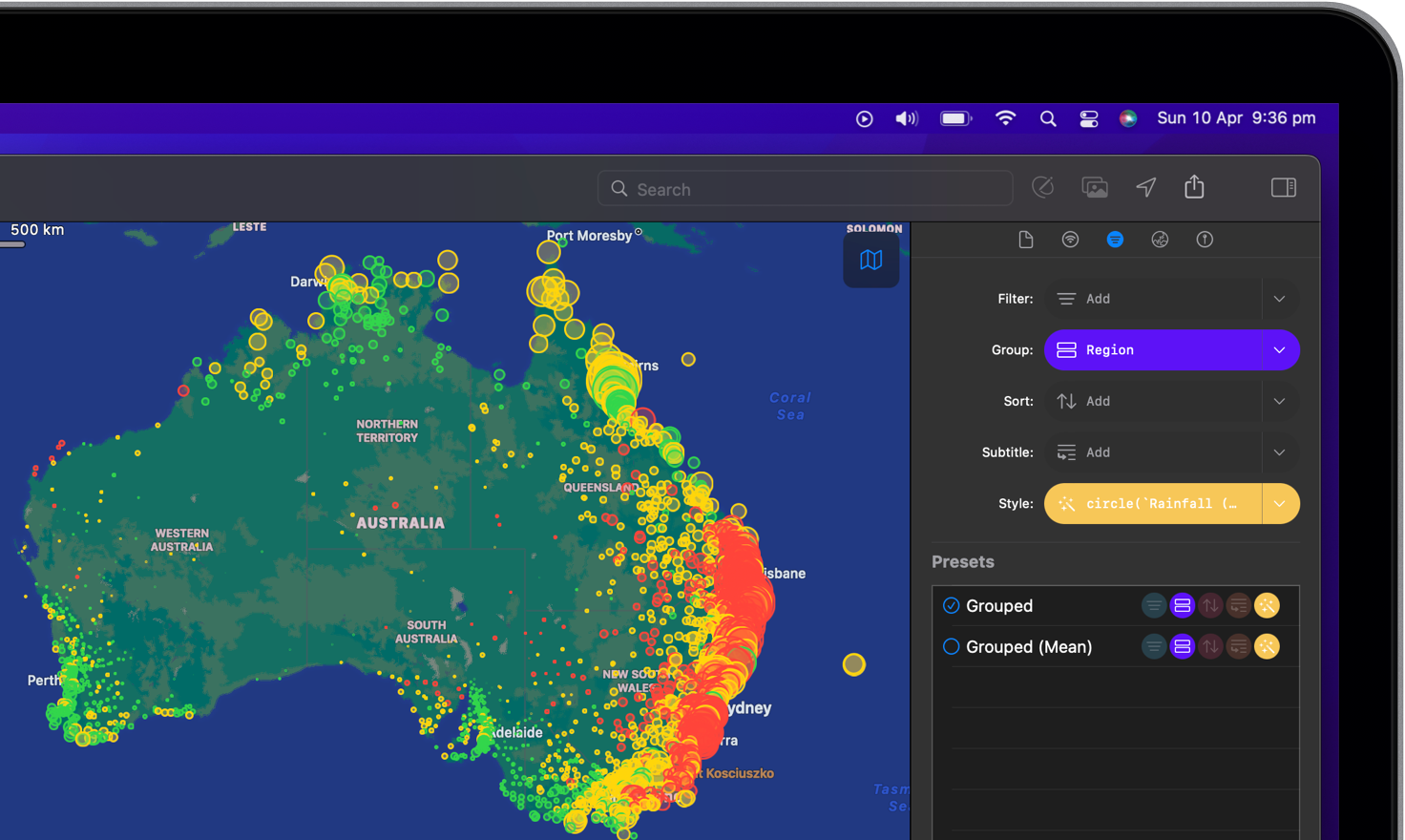
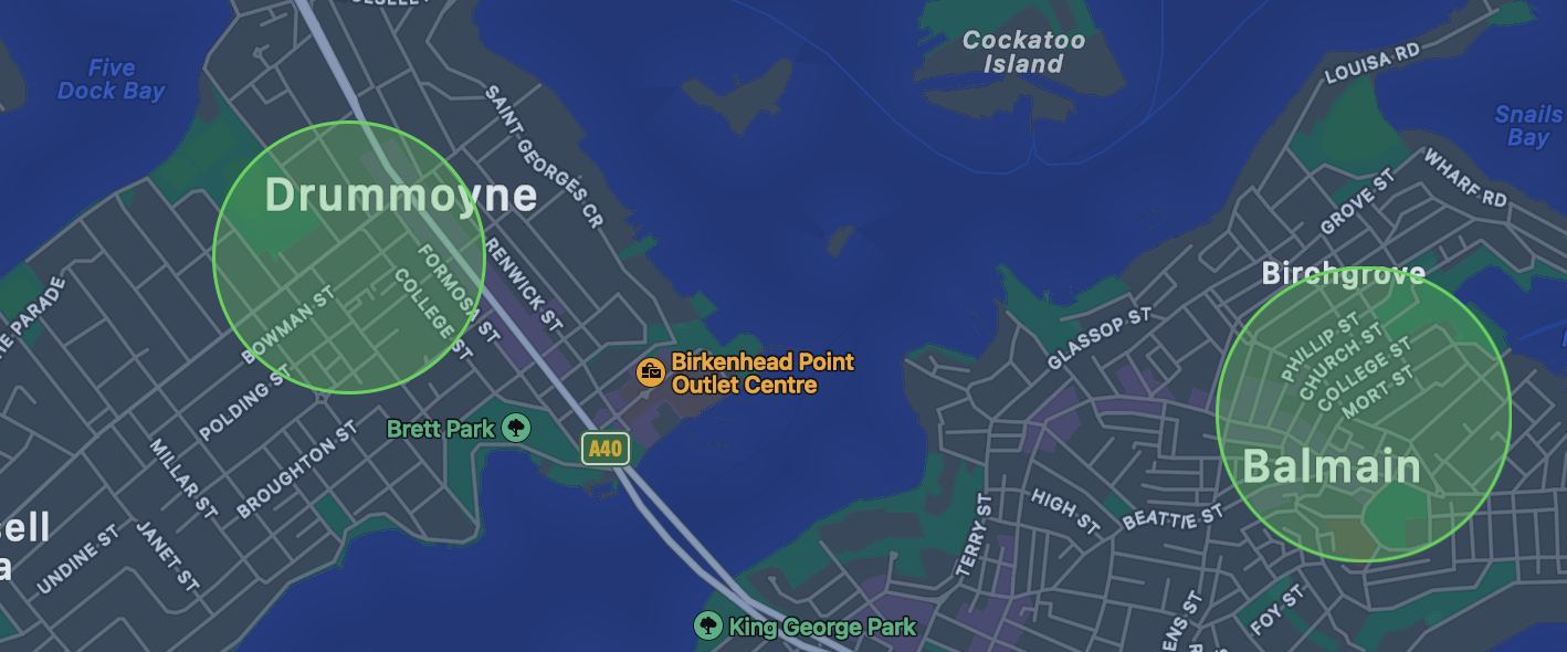
Circles are a great way to display intensity of a particular event in a particular area. For example, the amount of rainfall over a year or the number of COVID19 cases.
Example

To display a circle of which the colour and size depends on a specific number field, write: circle(3 * sqrt(number_total / pi), (number_field ?? 0) == 0 ? green : (number_field ?? 0 <= 10 ? yellow : red)).
Rectangles
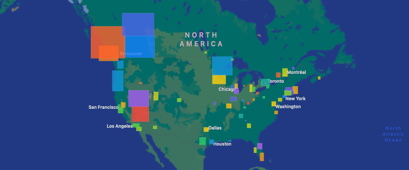
Rectangles are useful to show boundary boxes of, for example, where a particular service works or doesn’t work.
Example

To display rectangles of which the size depends on a specific number field and the colour is auto generated, write: transform("BoundingBox").fill(gradient(index % 20, 'rainbow', 0, 19)).