Colour your neighbourhood

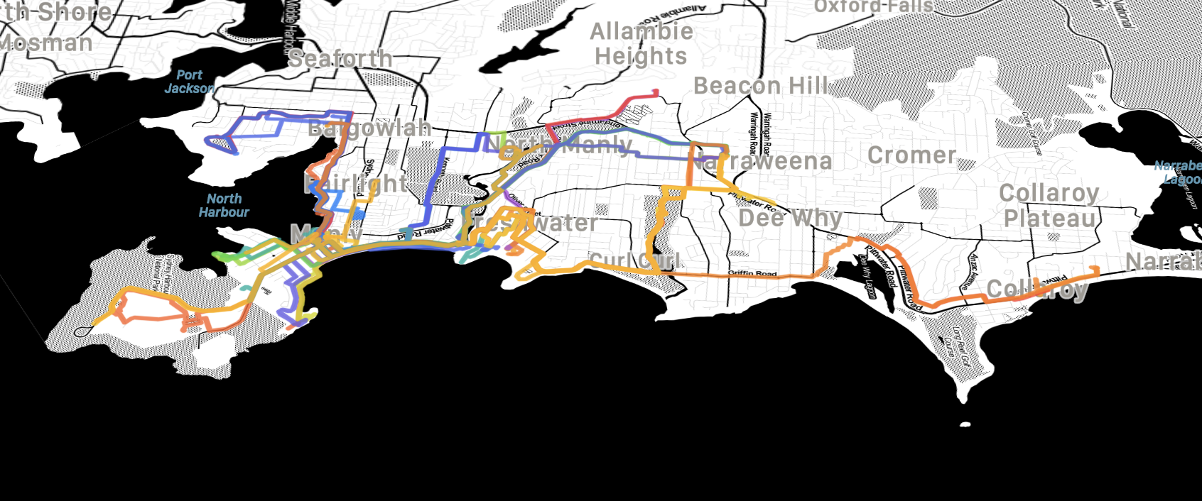
Do you track your outdoor workouts with a GPS-capable fitness tracker, your phone or your smart watch? If so, you can use Maparoni to turn them into a nice artwork that shows how your tracks are colouring your neighbourhood.
Here’s how to do it:
Firstly, you’ll need to export your workouts in a format such as GPX or KML, that Maparoni can import. Did you know that if your workouts already make it to your phone’s Health app, that you can export them? They are part of the bulk export of your health data, than you can get by opening the Health app, tapping your avatar in the top right, and then selecting “Export All Health Data”. You’ll then get a ZIP folder that includes your workout routes.
Secondly, create a new collection and then import the workout files, e.g., by dragging and dropping them into the collection or by using the “+” > “Import…” option. You might have a ton of these files, so make sure to select them all. In the import screen, you can then confirm that they can be imported correctly. Press “Validate” and then press “Done” to add them to your collection.
Thirdly, make the route lines on the map colourful by tapping on “Organise”, then selecting “Style” and then “Rainbow”. That’ll apply a style which is using this potentially cryptic looking formula:
colored(gradient(index % 20, 'rainbow', 0, 19))
Let’s take this apart: This is using the colored(Color) formula, which overwrites the colour of each location in your collection with the provided “Color” value. In the case of workouts, it’ll change the colour of each route on the map. Which colour does it use? It’s calculated using gradient(value, 'rainbow', start, end): This returns a single colour along the rainbow gradient. In the formula “start” represents the value for red, and from there it goes via orange, yellow, green, blue, and indigo to purple at “end”. Which specific colour is returned depends on “value” which is then looked up on that gradient. For the value the formula uses index % 20, which means what number is the workout in the list, modulo 20, i.e., the first workout gets value 0 (red), the second gets 1 (orangish-red), and so on, the 18th gets 19 (purple), the 19th gets 0 (red) again, the 20th gets 1 (orangish-red) and so on.
Lastly, let’s change the map tiles to draw colourful on a grayscale map. The screenshot above uses Stamen’s Toner map tiles. You can use these in Maparoni by tapping the map button on the map, selecting “Custom tiles…” and then pasting this template URL: http://[a,b,c].tile.stamen.com/toner/${z}/${x}/${y}.png
Pretty, isn’t it!
Have a play with the formula for the colouring by changing the numbers, or using other available gradients such as 'traffic' (red, yellow, green) or alpha (a fixed colour of your choice, but with an alpha value applied). Does your GPS tracker include additional information? If so, add a field for it and colour the routes according to their types. When importing GPX, Maparoni also creates startTime and endTime properties for which you can create fields of type ‘Instant’ and then use in formulas and colour lines by their duration, or combine that with the built-in length formula that returns the length of a route in metres and then colour based on your average speed (e.g., get km/h by using: (endTime - startTime) / length * 3.6).